← Back to work
UI / UX
Webflow
Accessibility
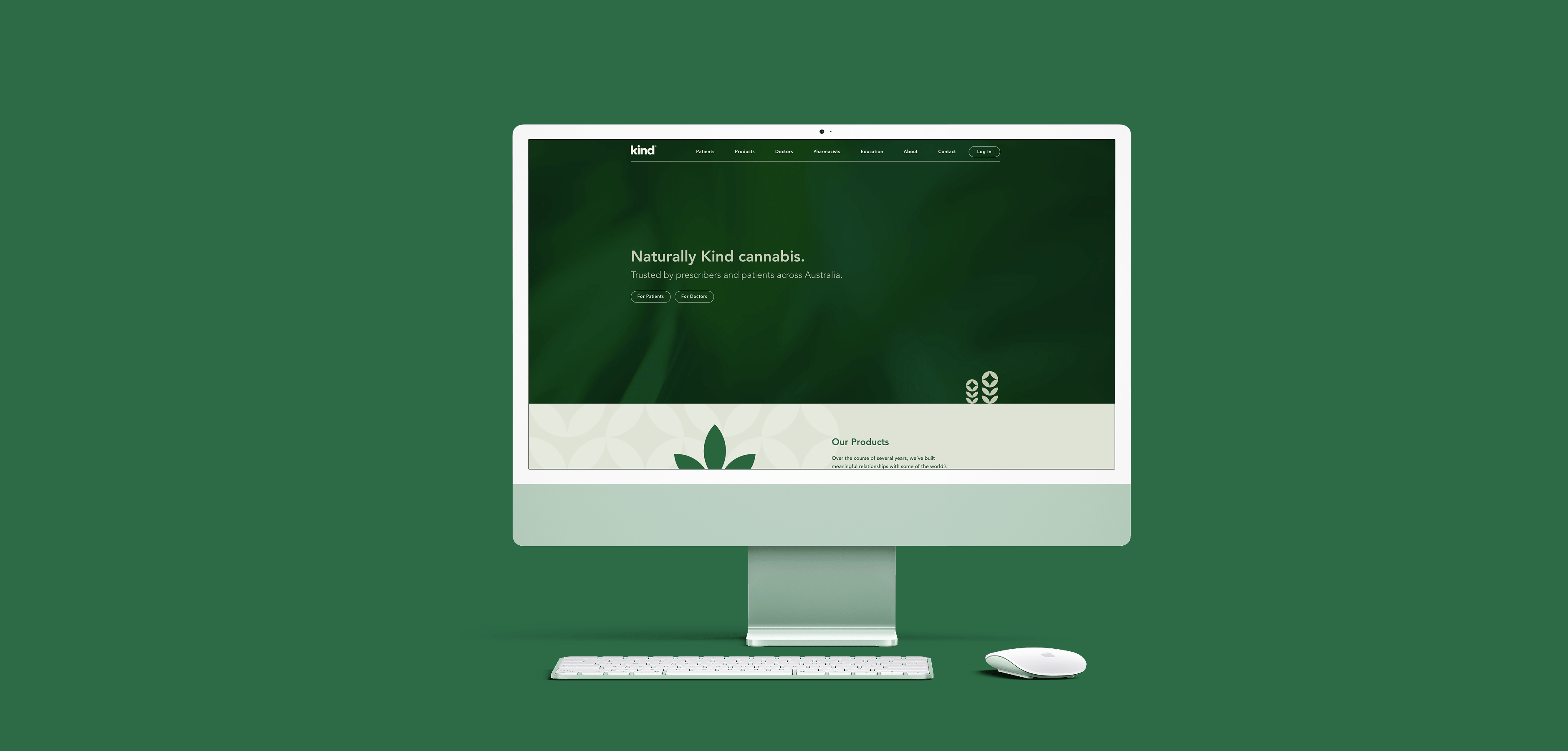
Kind Medical
Redesign
Led the full Webflow redesign of Kind's medical cannabis platform, taking a new brand identity and building a clean, accessible site from scratch for patients and healthcare professionals.
Role UX / Webflow Designer
·
Year Feb – Apr 2026
·
Client Kind Medical
·
Tools Figma, Webflow
View live site ↗
94
Lighthouse accessibility score
92
Lighthouse SEO score
30+
Pages redesigned and built
10wk
From brief to launch
The brief
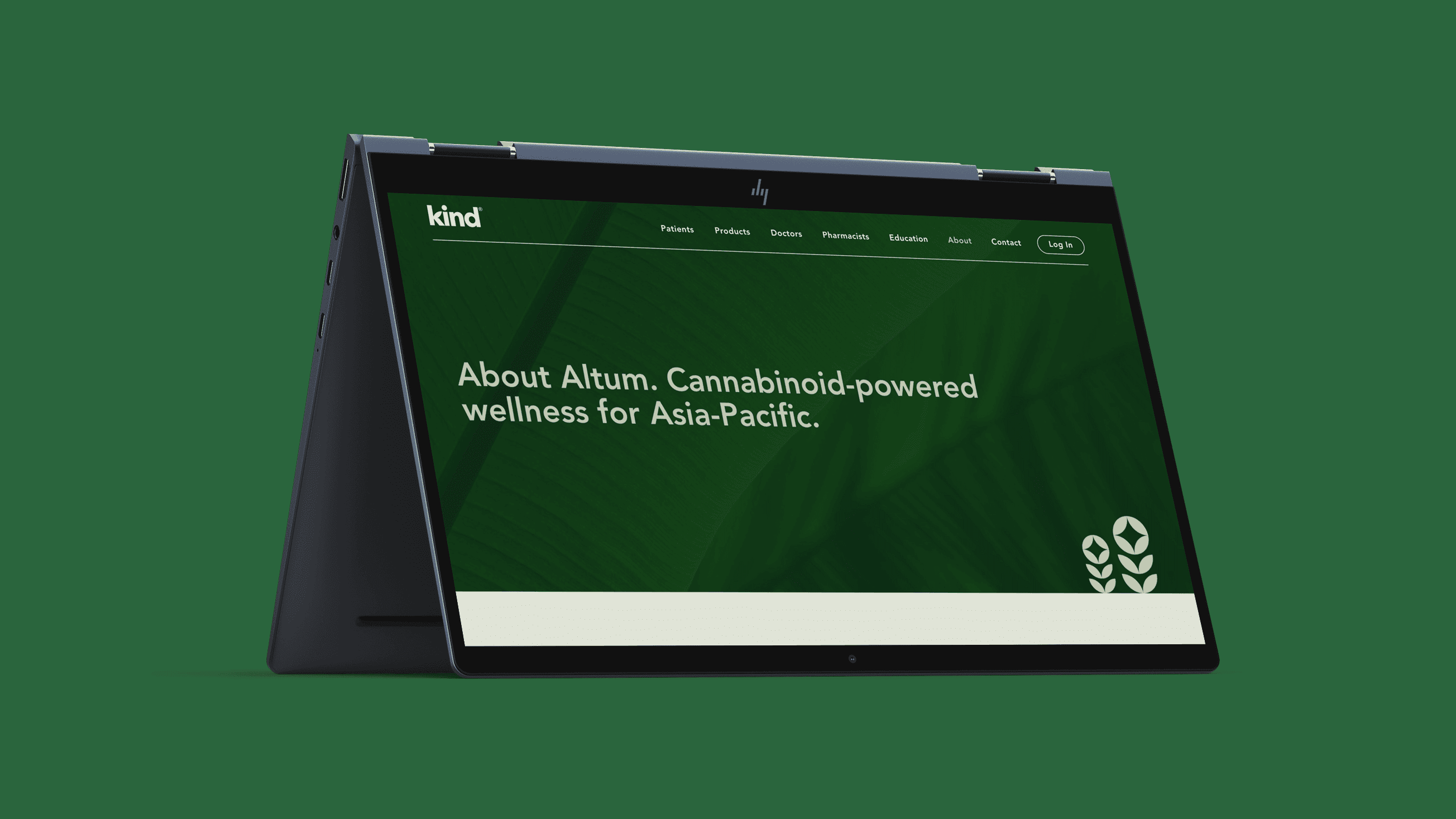
Kind is an Australian medicinal cannabis company that helps patients access treatment through healthcare professionals. They were going through a full rebrand, new logo, new visual identity, new direction, and needed a website to match.
My job was to take what the graphic designer had built and turn it into a real, functioning Webflow site. That meant designing the system, building the components, and making the whole thing work across 30+ pages.
The challenge
Medical cannabis sits in a complicated space. Kind's audience is split between patients looking for information and healthcare professionals navigating prescribing resources. Both groups need clarity and trust, and they need it quickly. Any friction, any confusion, any inaccessible element is a real problem when the stakes are someone's health.
That framing shaped every decision I made throughout the build.
Where I pushed back
The brand guidelines called for all-lowercase typography. It looked clean in isolation but felt wrong the moment I put it on a medical page. Lowercase removes the visual anchors that help people scan, headings stop feeling like headings. For a site where a patient might be looking for dosage information or a prescriber resource, that's not a stylistic preference. It's a functional problem.
I made the call to shift to sentence case. I also flagged several colour pairings from the initial brand that didn't meet WCAG AA contrast standards, and reworked them before anything went live. It meant pushing back on some early brand decisions, but the team was receptive and the accessibility case was clear.
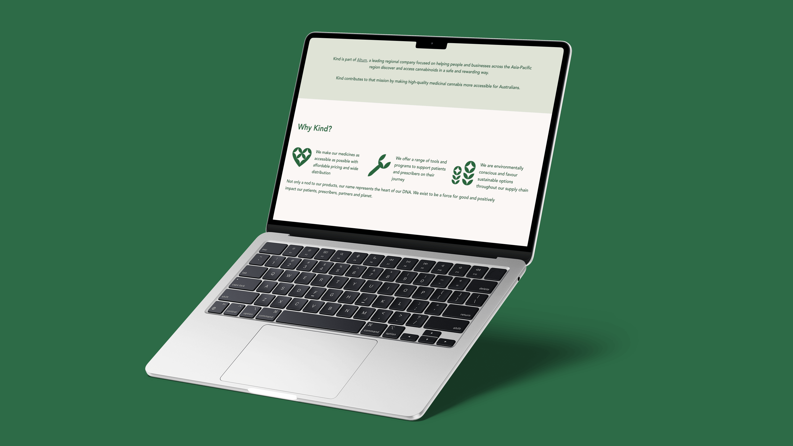
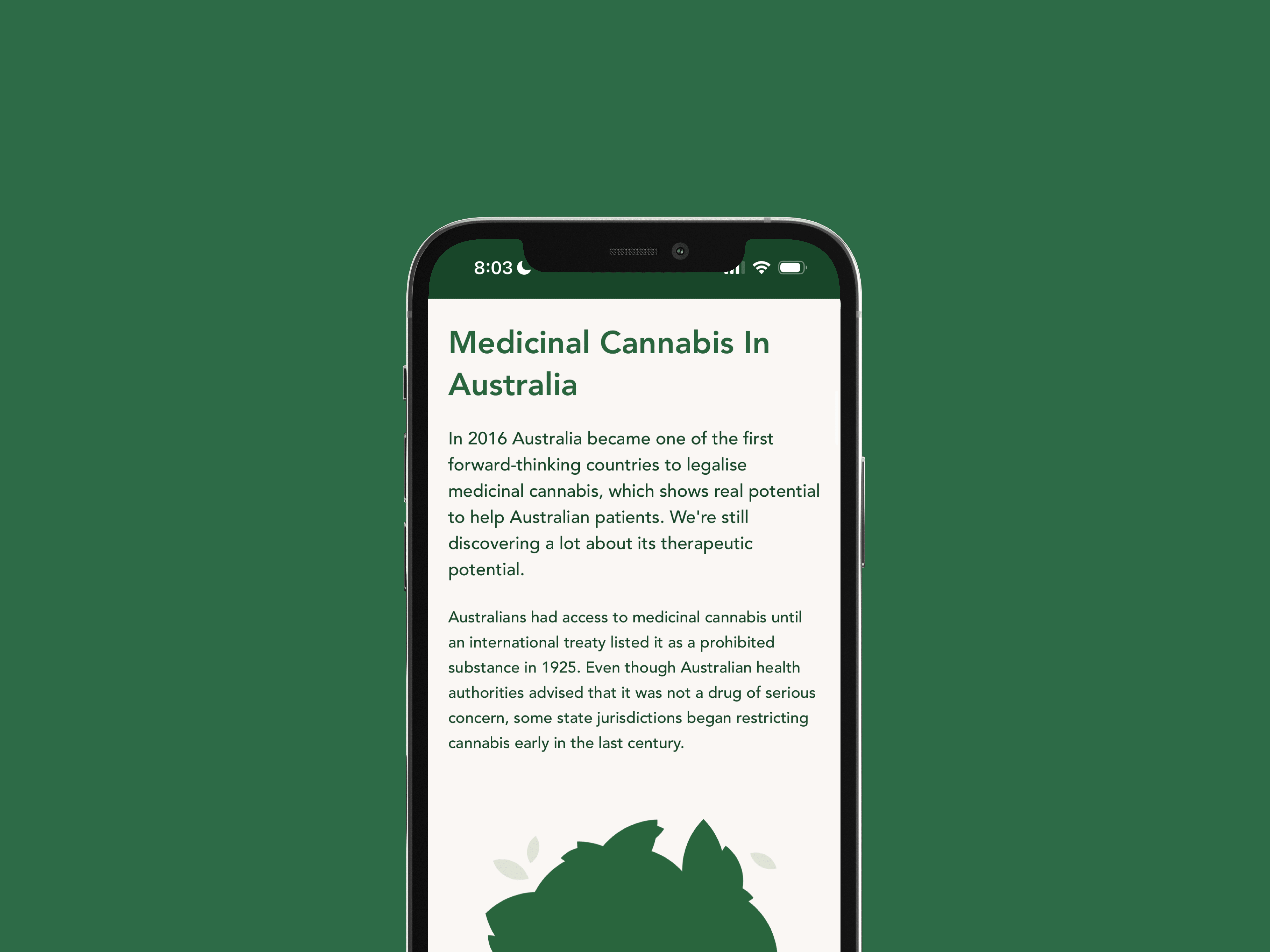
What I built
The site covers the full patient and healthcare professional journey, from product discovery through to prescriber resources. I built a reusable component system in Webflow so the client could manage content themselves after handover without breaking anything.
Before the build I also conducted competitor research during the initial rebrand phase, which helped shape the information architecture and the tone the site ultimately landed on.