← Back to work
UX Research
UI Design
Mobile
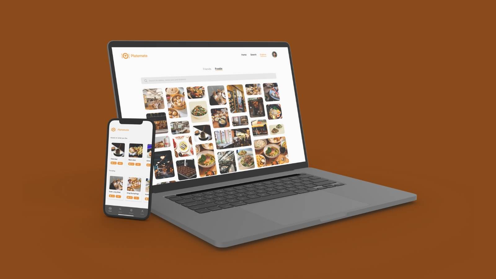
Platemate
A restaurant discovery platform built around the real frustrations of trying to find somewhere to eat, slow decisions, inaccurate listings, and platforms that treat dietary needs as an afterthought.
Role UX Research, UI Design
·
Year Aug – Nov 2023
·
Team Judy, Julia, Prue
·
Tools Figma
View project PDF ↗
8
Semi-structured interviews
26
Survey responses
3
Focus groups conducted
86
System usability scale score
Where it started
The brief was open-ended: identify a real problem and design a mobile solution for it. We started where most good research starts, just talking to people. What kept coming up was how genuinely annoying it is to decide where to eat.
Not in a minor way. People were spending 20, 30 minutes scrolling through apps, cross-referencing Google Maps, asking friends, and still ending up somewhere mediocre. And for anyone with dietary restrictions or allergies, the experience was even worse, most platforms treat filtering as a checkbox, not a feature.
The problem wasn't a lack of restaurant apps. It was that none of them actually solved the decision.
What the research told us
We ran 8 semi-structured interviews, 3 focus groups, 26 survey responses, and 8 contextual observations. The goal was to understand not just what people do, but why they do it and what frustrates them in the moment.
Three things came through clearly. Finding a restaurant takes too long. Existing information is often outdated or inaccurate. And dietary needs, allergies, intolerances, preferences, are consistently underserved. The last one mattered most to us, because it doesn't just affect the experience. For someone with a serious allergy, a bad filter can have real consequences.
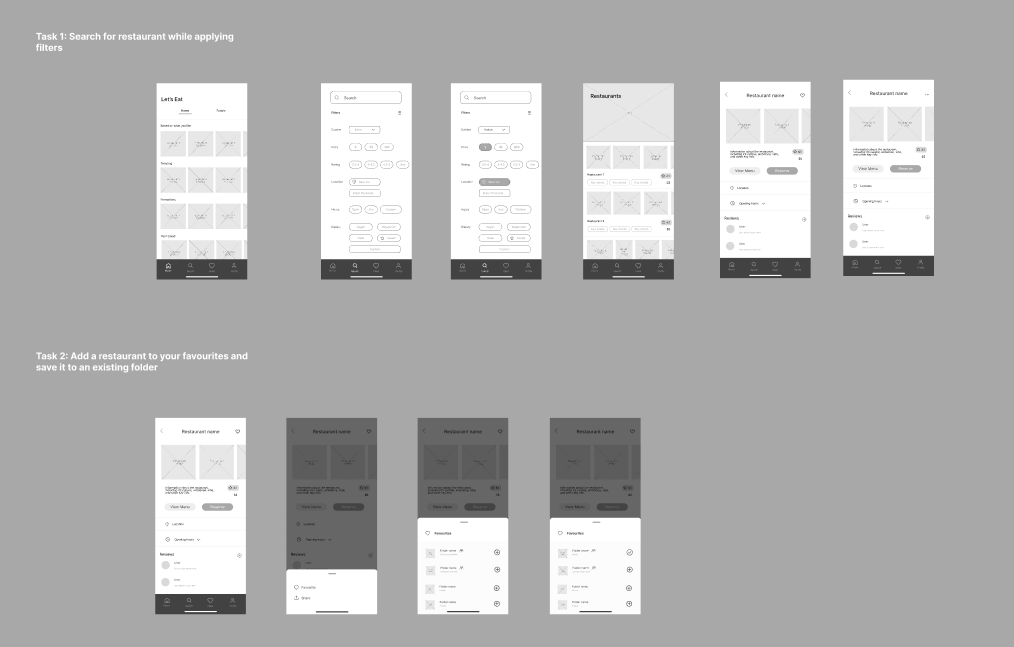
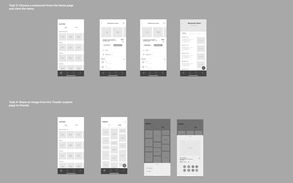
How we designed it
We used Crazy 8s and reverse thinking to push past the obvious solutions, then a decision matrix to get to one direction. From there it was sketches, wireframes, mid-fidelity Figma mockups, and two rounds of user testing using think-aloud protocols and cognitive walkthroughs.
Every round of testing gave us something specific to fix. Visual hierarchy that wasn't working. An icon that read wrong. A profile page that wasn't pulling its weight. We didn't move on until we'd addressed what the tests surfaced.
Testing early with real users meant we weren't guessing when it mattered, we were fixing things that we knew were broken.
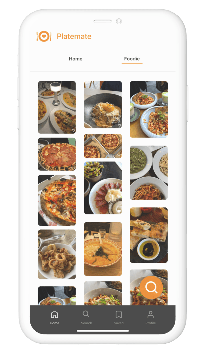
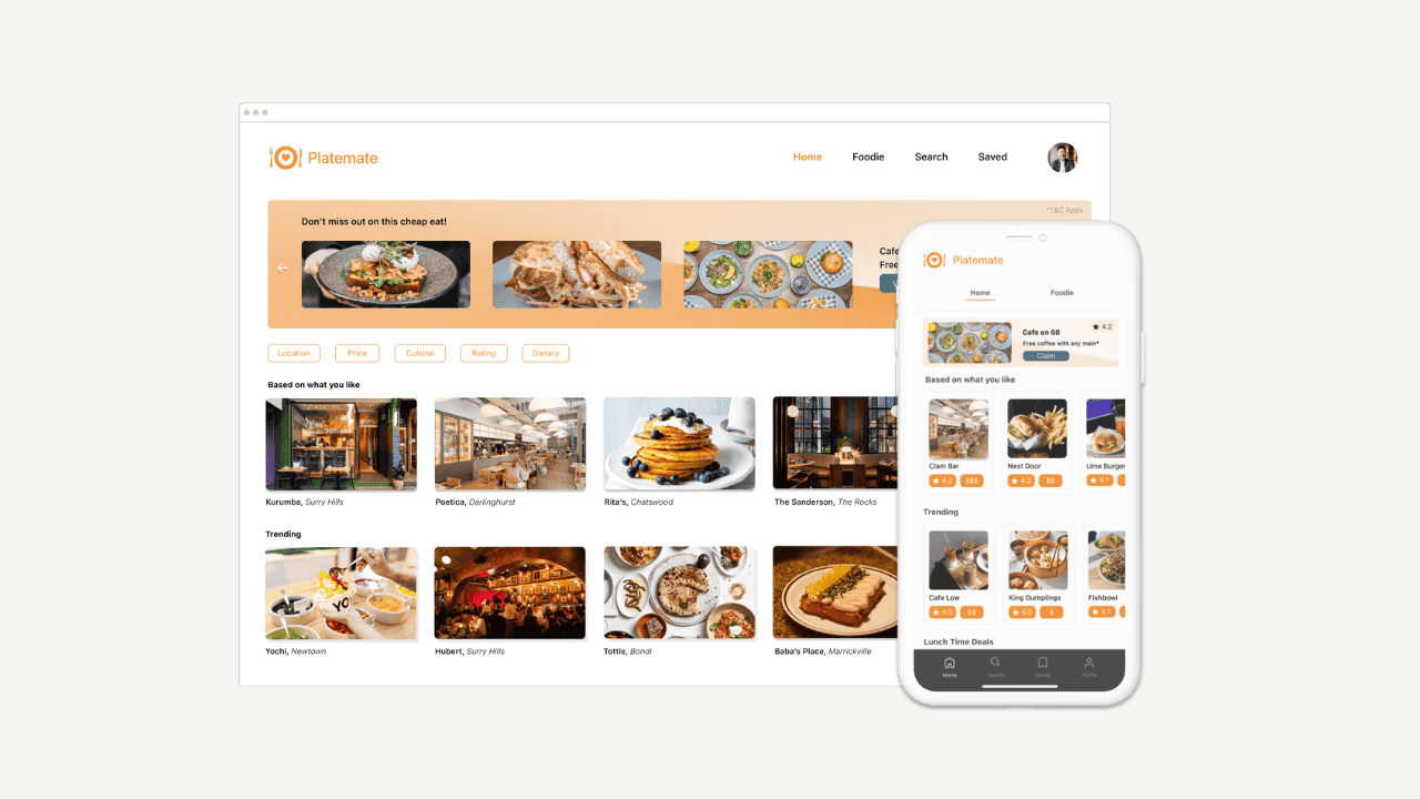
What we built
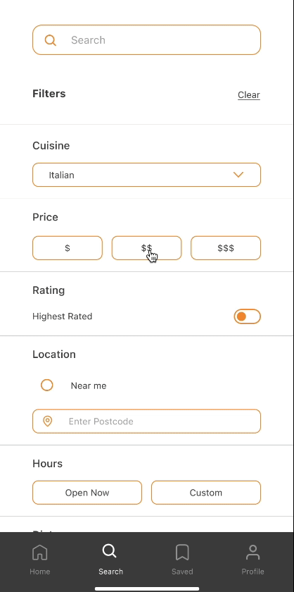
The final platform has four main sections: Home, Search, Explore, and Profile. The Search page has deep filtering, cuisine, price, distance, dietary requirements, and allergy flags that live in the user's profile and apply automatically every time they search.
We added an Explore Friends page so users could see where people they follow had been. It sounds simple, but it changes the feel of the whole app. A recommendation from someone you trust is worth more than ten algorithmic suggestions.
The explore screen and allergy filtering flow, built around what users actually needed
How it landed
The final prototype scored 86 on the System Usability Scale, sitting in the "excellent" range. User feedback called out the filtering depth and the social features as the most useful parts of the app. The dietary filtering in particular landed well. Multiple participants said it was the first time they'd felt like a platform had actually accounted for how they eat.
What I learned
- The research was what led us to dietary filtering as the main focus. Without it we would have built something much more generic and not that different from what already exists.
- Testing kept catching things we'd stopped seeing — an icon that read wrong, a profile page that wasn't earning its place. You go blind to your own work faster than you think.
- We nearly scrapped the Explore Friends feature because it felt like a nice-to-have. User feedback said it was one of the best parts of the app, which was a good reminder not to make that call too early.