The idea
The brief was to design an AR experience that raises awareness about an environmental issue. We chose endangered sea lions, and decided early on that we didn't want to make something people could ignore.
Most conservation content is passive. A poster, a video, a social post, you consume it and move on. We wanted to make something that physically places you next to the animal, makes you interact with it, and gives you a direct path to do something about it. The AR format was the only way to do that.
We weren't trying to inform people. We were trying to make them feel something, and then give them somewhere to put that feeling.
Designing for a new medium
Neither of us had used Lens Studio before. That was part of the point, the brief was about learning a new tool, not just applying what we already knew. But AR has constraints that flat screen design doesn't.
Field of view matters. Where UI elements sit in 3D space matters. The physical position of someone's phone while they're using the experience matters. Things that are obvious on a screen, like where to put text, become design problems when the canvas is the real world.
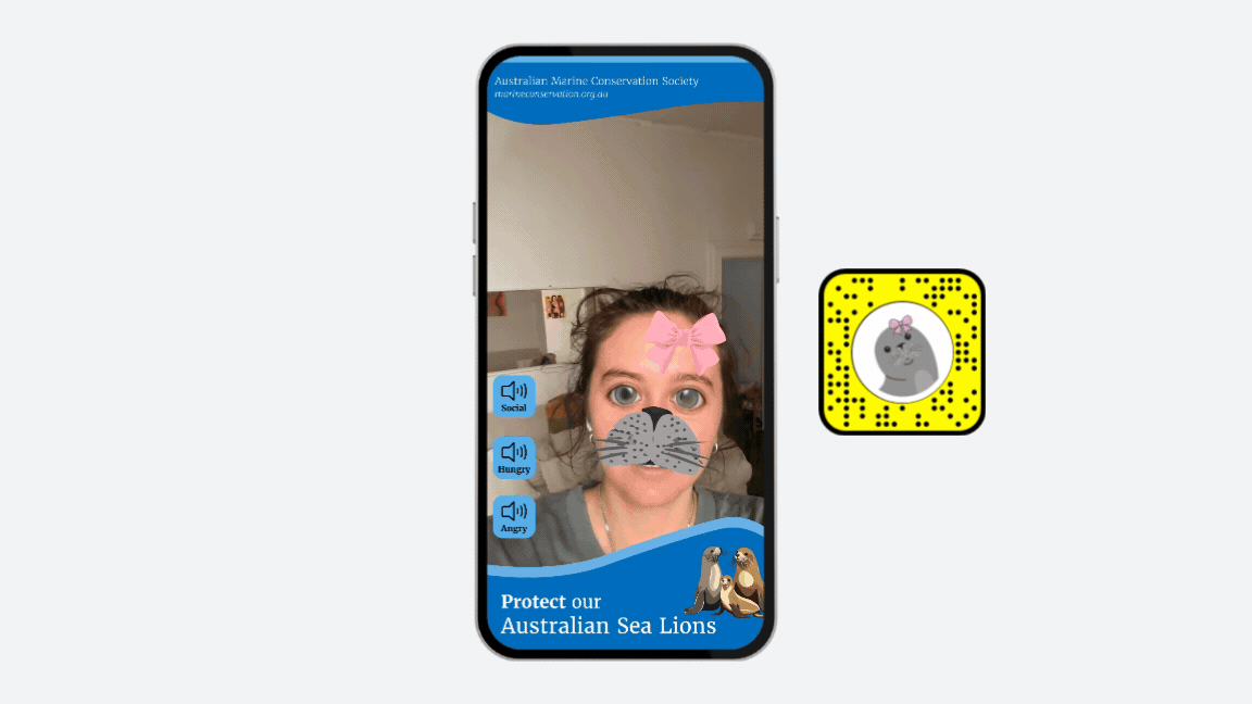
First prototype and what broke
The first round of think-aloud testing surfaced two clear problems. The marker tracking was too far to the side of the field of view, users had to actively look for it rather than seeing it naturally. And there was too much text on screen at once, which made the experience feel like reading an information panel rather than interacting with something.
We went back in with specific fixes: moved the marker tracking to a more central position, cut the text down significantly and added imagery to carry more of the information, introduced a "Look around" prompt for the rear camera, and added a face filter. Smiling or opening your mouth plays a sea lion sound, which immediately made the experience feel more playful and alive.
Second iteration
The second round of testing led to another set of refinements. We added a soundboard, a set of buttons users could press to hear different sea lion calls. It sounds like a small addition, but it shifted the whole tone of the experience from educational to genuinely interactive. People spent longer in the experience and were more likely to find the conservation link.
We also improved image resolution in the marker tracking and added a cleaner call to action, a direct link to a conservation organisation rather than just a piece of information. The experience now had somewhere to send people.
The soundboard wasn't in the original plan. It came out of testing. That's the part I'm most glad we made time for.
Final experience, soundboard, face filter, and conservation call to action all live